![]()
J. Herbin was established in 1670 and that means J. Herbin is the oldest name in ink production in the world. The company is famous for making ink for Louis XIV, and a black ink for the sole use of Victor Hugo, author of The Hunchback of Notre Dame and Les Miserables. These formulas still reside in company’s headquarters in Paris. I believe it would be cool to bring them back in some special edition pack 🙂 Victo won’t mind I believe.
At the moment company belongs to Exaclair Inc, that has rights to brands like Clairefontaine, Rhodia, Brause or G. Lalo.
J. Herbin offers 30 standard colors:

- Ambre de Birmanie
- Bleu Azur
- Bleu Myosotis
- Bleu Nuit
- Bleu Pervenche
- Bouquet d’Antan
- Bouton d’Or
- Cacao du Bresil
- Cafe des Iles
- Diabolo Menthe
- Eclat de Saphir
- Gris Nuage
- Larmes de Cassis
- Lie de The
- Lierre Sauvage
- Orange Indien
- Perle Noire
- Poussiere de Lune
- Rose Cyclamen
- Rose Tendresse
- Rouge Bourgogne
- Rouge Caroubier
- Rouge Opera
- Rouille d’Ancre
- Terre de Feu
- Vert Empire
- Vert Olive
- Vert Pre
- Vert Reseda
- Violette Pensee

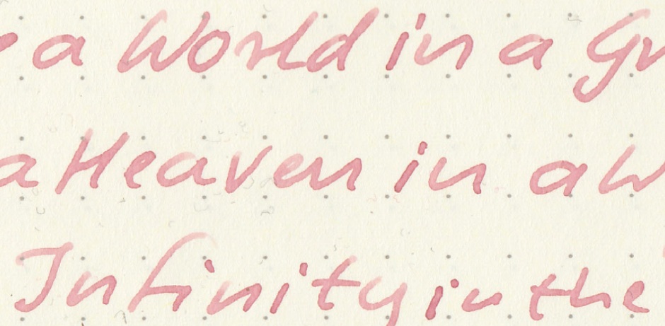
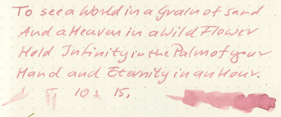
I know many people find J. Herbin inks too muted and boring but I enjoy most of them. I believe J. Herbin makes amazing and unique ink and Rouille d’Ancre is one of those unique colors. I’d like to say I dislike it, because, c’mon, I’m a man. But I can’t. i kind of like it. It’s like dusty mauve-pink with some vintage charm. I don’t know many colors similar to this one. Maybe Diamine Carnation – in a way?
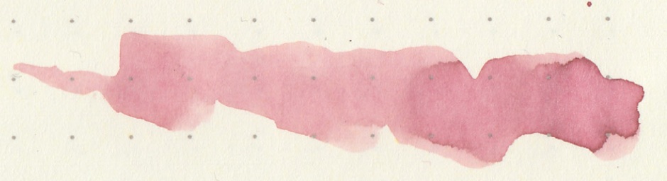
I find it intriguing and keep on coming back to it. The ink is well bbehaved but rather muted, so in order to fully enjoy its richness you would do well and behave wisely by choosing nib with generous flow.
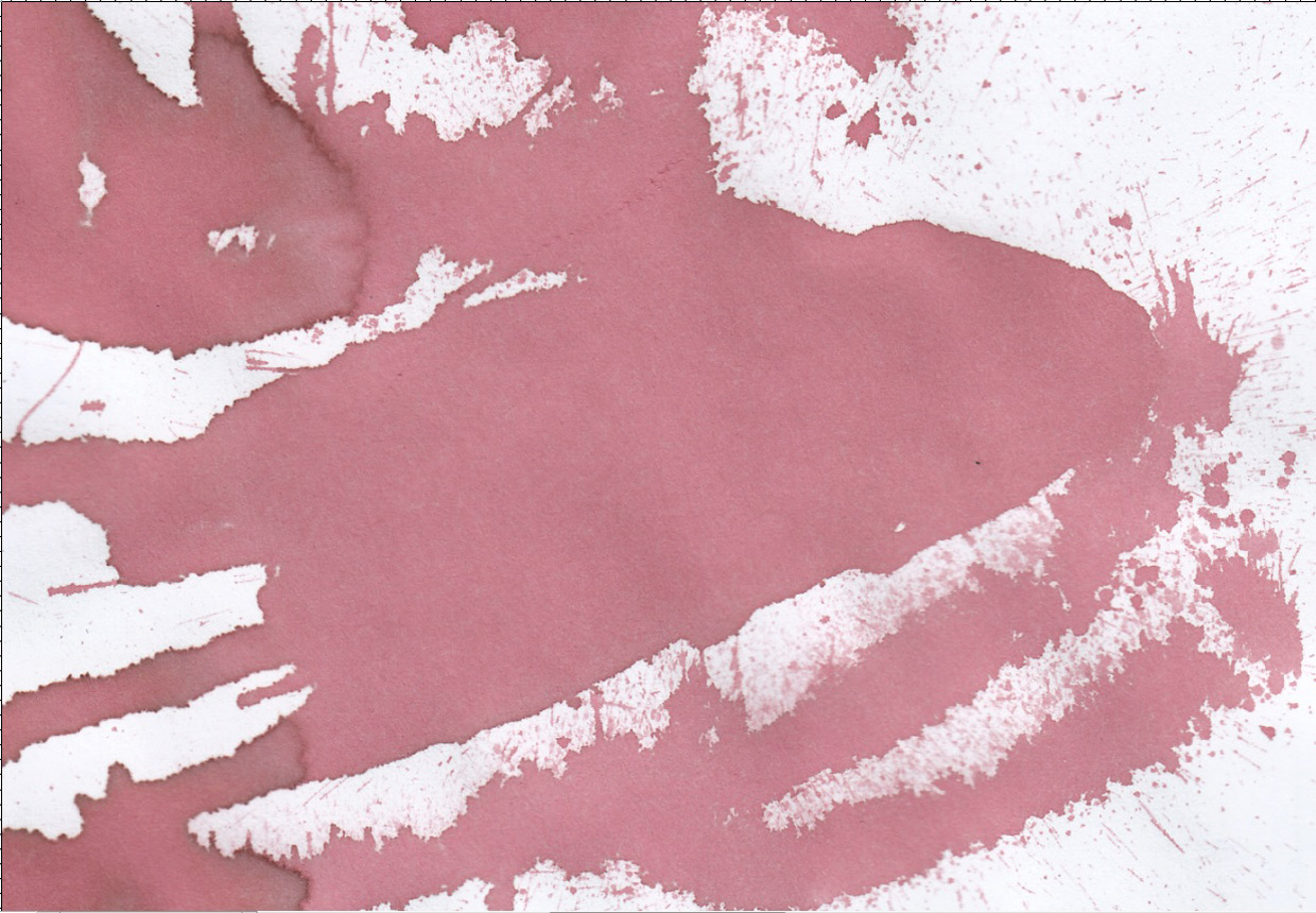
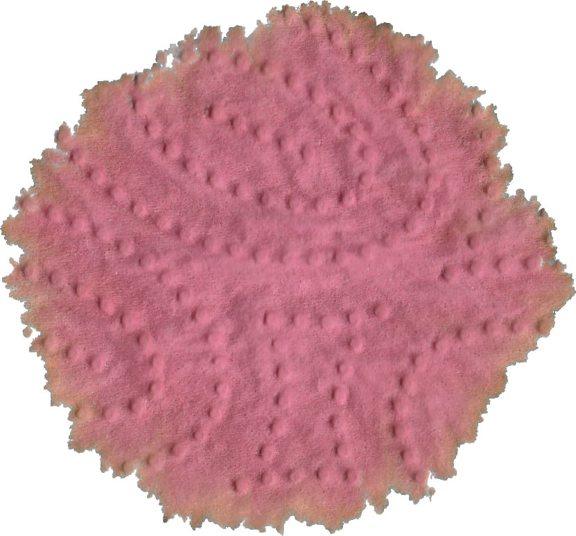
Drops of ink on kitchen towel
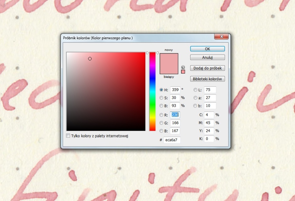
Software ID
Color range

Oxford notebook, Kaweco Sport Classic, B


Leuchtturm1917, Wing Sung 680, fine
Semikolon, Kaweco Sport Classic, B


Clairefontaine, Kaweco Sport Classic, B nib + Kaweco Al Sport, B nib


Hero 5028, stub 1,9


Oh ! This ink looks like a J. Herbin : light, etc… 🙂
The charm of the discretion. “Rouille d’ancre” is a sailor ink.
I like it which appears sometimes more “corail”. Or I have to change my glasses.
Ink is a dress colour. Each event, each coloured dress for the nib.
Une chose est certaine, vous ne manquez pas de vocabulaire et de techniques pour décrire les encres.
Merci.
LikeLiked by 3 people
De rien, j’aime bien décrire des encres.
LikeLiked by 1 person
Really wish J Herbin bottles were cheaper. I like my bottle of Cacao du Bresil for sketching but here in the US it’s actually cheaper for me to draw with Iroshizuku Kiri-Same. Noodler’s doesn’t have an ink that compares to either.
Thanks for all the reviews Vismamitra, they help a lot.
LikeLiked by 1 person
I think people generally underestimate J. Herbin inks which is a shame. They are one of my favorites. I may get a bottle of Rouille d’Ancre after seeing this review.
LikeLike
This is a favorite of mine and such a subtle ink – but a challenging one!
On its own it may seem (discreetly) pink, but alongside any other pinks, it just looks “beige”!
In a wet nib the “rust” is quite lovely.
More variable than most with nib and paper and impossible to scan – get yourself a 10ml bottle, abandon it in disgust . . . . and then come back to it repeatedly and with increasing interest.
If this doesn’t fit your criteria for an interesting ink, maybe the deficiency is with your criteria?
. . . . which is in no way a criticism of Wondernaut, for whom we have significant respect, but a challenge to the reader – are you able to appreciate such a subtle ink?
LikeLiked by 1 person
Excellent comment. You nailed it.
LikeLike